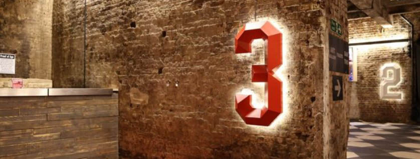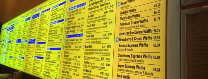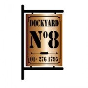
Inksplash were recently approached by Dockyard No8, a new cafe in Bray, to help with the launch of their new business. They needed a new logo,wall graphics and light-box sign that would fit their image and location, the harbour in Bray, Co. Wicklow.
They wanted something that looked like it came straight from an old dock yard, something new that looked like something old. A challenge? Yes. Impossible? Never. Inksplash’s in-house design team, Cre8tive Web, put their heads together and came up with something that ticked all the boxes for the client.
The light-box the guys designed resembled an old rusty box, something that looked like it had been weathered for years by sea air and salt water, on a dockyard for example, with fret cut letters and opal acrylic pushed through to ensure the illumination is evenly distributed from the letters at night time. Think it’s easy to make a brand new, stainless steel box look like an old, rusty wreck? Think again. A LOT of work went in to getting it looking just right.
The end result? A very impressive, perfectly old-looking & rusty illuminated sign with a wow-factor.. And a VERY happy customer. Job done.


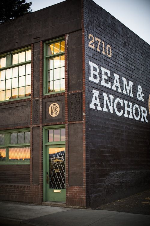 Companies are now seeing the benefits of investing in quality signage for their brand. Some Great examples of creative signage in this article.
